

Modern outdoor identity is a purposefully restrained, lifestyle-driven brand system that signals who customers become when they adopt the outdoors, not just what gear they own. It is the industry’s shift from functional product description to curated lifestyle signal, and every serious outdoor brand needs to understand it before briefing a designer.
Before you read further, run this three-point screen on any identity work in front of you:
- Visual restraint: Does the system use a limited palette and clean geometry, or is it cluttered with literal icons and gradient fills?
- Narrative platform: Does the brand have a consistent story about who its customer becomes, or does it only describe product features?
- Touchpoint coherence: Does the identity hold up across apparel, packaging, social, and events, or does it fragment by channel?
If any of those three fail, the identity work needs to go back to brief.
Table of Contents
- What does “modern outdoor” actually mean for your brand?
- What visual rules should you give your design team?
- Where does modern outdoor identity show up across your touchpoints?
- How do you build a modern outdoor identity from scratch?
- What can you learn from brands that got this right?
- How do you know if the identity launch actually worked?
- Key Takeaways
- The identity move most outdoor brands still miss
- Useful sources and further reading
What does “modern outdoor” actually mean for your brand?
Modern outdoor design is defined by intentionality, restraint, and cohesion rather than a single aesthetic trend. That distinction matters for brand managers because it means “modern” is not a visual style you can copy from a mood board. It is a set of principles you build into every decision.
Here are the six core principles that separate a genuinely modern outdoor identity from one that only looks current:
- Indoor/outdoor continuity: The line between interior and exterior is dissolving, and brand identity must move fluidly across both contexts. A logo that reads beautifully on a retail wall must also work on a boat decal in direct sun.
- Versatility for lifestyle signaling: — The identity works on a performance product and on a lifestyle tee without feeling like two different brands.
The shift from functional to aspirational is the biggest strategic move in this space. Brands that still lead with specs and outcomes are speaking to a shrinking audience. Brands that lead with who you become when you fish, hike, or build a life outdoors are building something durable.
Pro Tip: Avoid literal pictographic logos. A fish jumping out of water or a mountain silhouette tells customers what you sell, not who they become. Narrative platforms, a consistent story about transformation and belonging, create long-term coherence that a pictogram never can.
What visual rules should you give your design team?
The visual system is where principles become decisions. Here is what to specify in a brief.
Logo approach
Recent outdoor rebrands favor monograms, adaptable emblems, and custom-drawn wordmarks over multi-element pictograms. The reason is practical: a monogram scales from a 1-inch embroidered hat patch to a 10-foot event banner without losing legibility. A detailed fish illustration does not. Prefer bold, geometric, or italic letterforms that suggest movement and confidence.
Color palettes
Modern outdoor palettes run on restrained, nature-rooted neutrals, warm stone, deep forest, raw concrete, with one high-visibility accent for environmental legibility. That accent does real work outdoors: it separates your brand from the background in field conditions, on water, in low light. Limit the full palette to three or four colors. Every additional color is a coherence risk.
Typography
Dynamic, geometric, or condensed italic type signals movement and authority. For apparel and marine use, size matters more than style: minimum 14pt for body copy on labels, and test every font at the sizes it will actually be printed or embroidered. A typeface that looks sharp on screen can become unreadable at 8pt on a tackle package.
Imagery and materials
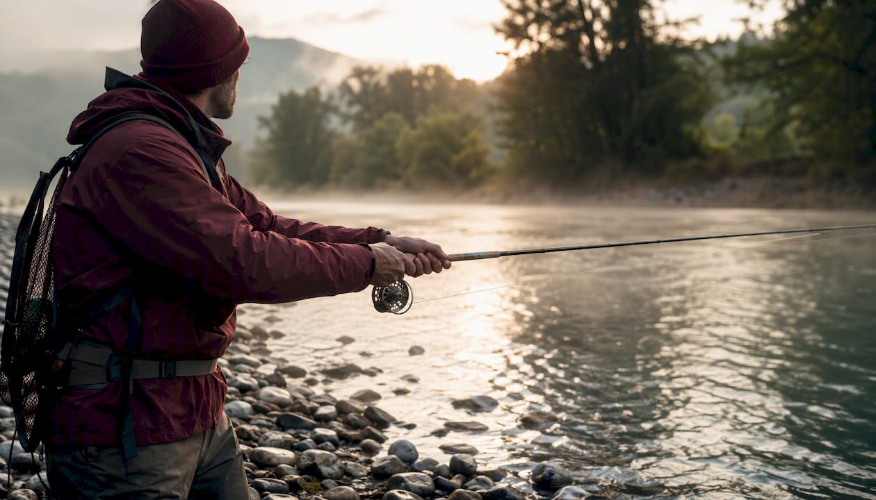
Photography should place a human in the environment, not just showcase the product on a white background. The lifestyle signal comes from context. Material cues, aluminum hardware, powder-coated finishes, solution-dyed fabrics, communicate durability and premium quality without a single word of copy. Minimalist product design reinforces this: restraint reads as high performance to the modern outdoor consumer.
Size, placement, and usage rules
| Element | Rule | Why it matters |
|---|---|---|
| Logo clearspace | Minimum clearspace equal to the cap height of the wordmark on all sides | Prevents crowding on apparel, packaging, and decals |
| Single-color lockup | Required for embroidery, vinyl decals, and screen print | Ensures legibility across production methods |
| Icon scalability | All icons must read clearly at 16px and at 3 inches | Covers digital and physical touchpoints simultaneously |
| Color usage | Primary palette only on product; accent color reserved for calls to action | Maintains hierarchy and prevents visual noise |
| Typography sizing | Minimum 14pt for field-use labels; 10pt for digital body copy | Outdoor legibility in variable light conditions |
Where does modern outdoor identity show up across your touchpoints?
Identity is not a logo file. It is every place a customer encounters your brand. Here is how to apply it channel by channel.
Product and packaging: Material-first decisions. Labels should use the restrained palette, minimal copy hierarchy (name, key spec, one brand line), and climate-rated materials that survive the environments your customers actually use them in. A label that peels off in rain is a brand failure.
Website and e-commerce: Hero photography should show humans in environment, not product on white. Product storytelling blocks should sell the identity first, specs second. The outdoor lifestyle your brand represents should be visible before the customer scrolls to the add-to-cart button.
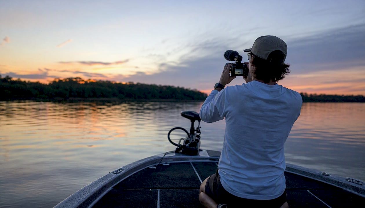
Social and content: Creator partnerships and user-generated lifestyle content outperform polished brand posts for outdoor audiences. Set clear rules: editorial posts (culture, environment, community) should outnumber pure product posts. The qualitative ratio rule is to keep community-driven content in the majority. Keep the visual palette consistent even in UGC by providing creators with a simple style guide. A fishing content series is one of the most effective formats for building this kind of consistent identity over time.
Retail and events: Environmental branding should use modular, reusable signage in the brand palette. Tactile assets, branded coolers, custom banners, embroidered staff apparel, carry the identity into physical space. Think of each event footprint as a room in the brand, with a floor (ground signage), walls (banners), and ceiling (overhead elements). Zoning by activity applies here just as it does in outdoor room design.
Channel checklist for your project brief:
- Product labels: palette-compliant, climate-rated, minimal copy
- Website hero: lifestyle photography, identity-first messaging
- Social: 2:1 editorial-to-product ratio, creator style guide
- Events: modular signage, tactile brand assets, zoned footprint
- Apparel: single-color logo lockup, embroidery-tested
How do you build a modern outdoor identity from scratch?
Here is a practical workflow. It runs lean for a focused rebrand or expands for a full system rollout.
- Brand brief: Document purpose, target archetypes, visual rules (palette, type, logo approach), mandatory assets, usage restrictions, sustainability constraints, and launch priorities. One page is enough for a focused brief. The 99designs outdoor inspiration gallery is a useful reference during this phase for translating principles into visual direction.
- Design phase: Start with low-fidelity prototypes. Test the logo as a monogram, a wordmark, and a combined lockup. Build applicative mockups: embroidered hat, vinyl boat decal, printed hang tag, social avatar. Accessibility and legibility tests for outdoor contexts are non-negotiable at this stage.
Timeline estimate: A lean rebrand (logo refresh, palette update, core asset set) runs 6–10 weeks with a focused team. A full system rollout (visual system, voice guide, all channel templates, field-tested assets) runs 16–24 weeks. Build in two weeks for field validation regardless of scope.
What can you learn from brands that got this right?
Three micro case studies, each with one visual rule and one narrative move to copy.
Case study 1: Monogram update. A regional outdoor apparel brand replaced a detailed mountain-and-river pictogram with a bold two-letter monogram in condensed italic type. The core move: the monogram worked at every scale, from a 1-inch woven label to a 6-foot trade show banner. The outcome: production costs dropped because single-color embroidery replaced multi-color screen print. What to copy: audit every place your logo appears and ask whether a simpler mark would perform better at the smallest size.
Case study 2: Lifestyle-first photography. A West Coast fishing brand rebuilt its product pages around human-in-environment photography, anglers on the water at dawn, gear in use, not gear on a table. The narrative move: every image answered “who do you become?” before it answered “what does this product do?” Engagement on product pages increased measurably. What to copy: shoot your next product campaign on location, not in a studio, and lead with the person, not the product.
Case study 3: Indoor/outdoor continuity. A tackle and apparel brand applied the same deep burgundy and clean condensed type across its retail pop-up, its e-commerce site, and its apparel line. The visual rule: one palette, one type family, everywhere. The narrative move: the brand story (built by anglers, for anglers) appeared in the same language on hang tags, social captions, and event signage. Customers recognized the brand before they read the name. For Pacific Northwest fishing and outdoor lifestyle apparel, this kind of coherence is what separates a brand from a product line.
What to copy from all three:
- Replace pictograms with adaptable monograms or wordmarks
- Shoot on location, lead with the human
- Apply one palette and one type family across every channel without exception
How do you know if the identity launch actually worked?
Pre-launch checks
- Asset inventory complete: logo files (all lockups, all formats), palette swatches, type files, photography library
- Channel readiness: website, social profiles, packaging, and event assets all updated simultaneously
- Field proofs: embroidery, vinyl decal, and print tests signed off
Immediate launch metrics
- Engagement lift on social posts featuring the new identity vs. the 30-day baseline
- Conversion rate on updated product pages vs. previous versions
- Share of voice in community hashtags and creator content
- Qualitative feedback from events and community channels within the first two weeks
90-day test plan
- Weeks 1–4: Collect baseline data. Run A/B tests on hero messaging (aspiration-led vs. spec-led). Monitor community growth rate.
- Weeks 5–8: Analyze first-round data. Adjust photography ratio if engagement signals favor one style. Gather product/packaging feedback from customers who received orders.
- Weeks 9–12: Evaluate conversion lift against pre-launch baseline. Assess brand recognition in community events. Decide whether to expand the system or refine before full rollout.
KPI definitions and reporting cadence:
- Engagement rate: Likes + comments + shares divided by reach. Report weekly for the first 90 days.
- Conversion rate: Orders divided by product page sessions. Report weekly, compare to 90-day pre-launch average.
- Community growth rate: Net new followers or community members per week. Report weekly.
- Qualitative brand recognition: Percentage of event attendees who can name the brand from visual assets alone. Survey at each event.
Key Takeaways
A modern outdoor identity succeeds when visual restraint, a documented narrative platform, and consistent touchpoint application work together as a single system.
| Point | Details |
|---|---|
| Define before designing | Write a one-page brand brief covering purpose, archetypes, palette, and usage rules before any creative work begins. |
| Replace pictograms | Swap literal icons for adaptable monograms or wordmarks that scale from embroidery to event banners. |
| Field-test every asset | Test logos on embroidered hats, vinyl decals, and printed labels before committing to a full production run. |
| Lead with aspiration | Structure every touchpoint to answer “who do you become?” before “what does this product do?” |
| Measure for 90 days | Track engagement lift, conversion rate, and community growth weekly for the first 90 days post-launch. |
The identity move most outdoor brands still miss
There is a gap between what modern outdoor identity promises and what most brands actually deliver. The promise is coherence: one visual system, one voice, one story, everywhere. The reality is usually a sharp logo, a great hero photo, and then total fragmentation the moment you look at the packaging, the event signage, or the product label.
The brands that get it right treat every touchpoint as a room in the same house. The palette on the hang tag matches the palette on the website matches the palette on the boat decal. The voice on the product page matches the voice in the social caption. That level of discipline is not a design problem. It is a management problem. Someone has to own the system and enforce it.
For fishing and tackle brands specifically, the biggest missed opportunity is the physical asset. A boat decal in the field is a moving billboard. An embroidered hat at a tournament is a walking endorsement. These assets do more identity work than any social post, but they only work if the logo was designed to perform at small scale in real conditions. Test it on the water before you print a thousand of them.
The other thing most brands underestimate: sustainability is not a marketing layer you add at the end. It is a material and process decision you make at the start. If your brand claims to stand for the outdoors, your packaging, your production methods, and your sourcing need to back that up with specifics. The modern outdoor consumer will check.
Useful sources and further reading
Build your brand brief and identity system with these resources. Adapt every example to your climate, product type, and audience before copying anything verbatim.
- What outdoor means now: sport, style, or identity?
- Modern Patio Design Ideas That Actually Work
- Team Outdoor Paris — Visual Identity :: Behance
- Francesco Meda and the landscape of contemporary outdoor living
- Designing the outdoor room: how modern architecture is erasing the line between inside and out
- What “Modern” Really Means in Outdoor Design
- Outdoor room design ideas
- 52+ Best Outdoor Brand Identity Designs 2026
The brand brief template referenced throughout this article is pasteable directly from the “How do you build a modern outdoor identity from scratch?” section above. Copy the five-step workflow, fill in your brand’s specifics, and hand it to your design team or agency as a working brief.
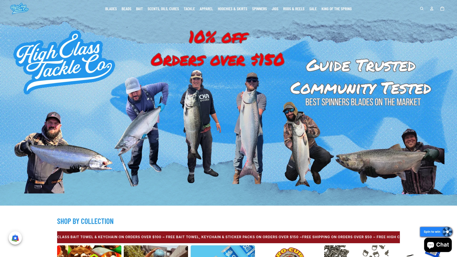
Ready to put a modern outdoor identity to work on the water? Highclasstackleco builds every product, decal, and apparel piece around exactly these principles: restrained, bold, and built for real conditions. Browse the full lineup and see what a coherent outdoor identity looks like when it ships.
0 comments